AI Takes Center Stage: Google Doubles Down on Innovation
That’s a wrap! Google Cloud Next 24 was in Las Vegas. The Pythian team was ready for another...
That’s a wrap! Google Cloud Next 24 was in Las Vegas. The Pythian team was ready for another...
The momentum of Google Cloud Next 2024 kept surging forward as the Developer Summit Keynote took...

The excitement in the audience was palpable as Google Cloud Next 2024 kicked off its opening...

As database administrators (DBAs) responsible for managing MongoDB replica sets, we are pivotal in...

Marketers have more capabilities available than ever to gain insights into their customers, and are...
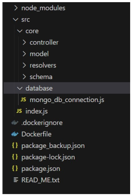
If you haven't read Part 1 of the Analyzing a Movie Dataset Housed on MongoDB Through GraphQL...
That’s a wrap! Google Cloud Next 24 was in Las Vegas. The Pythian team was ready for another...
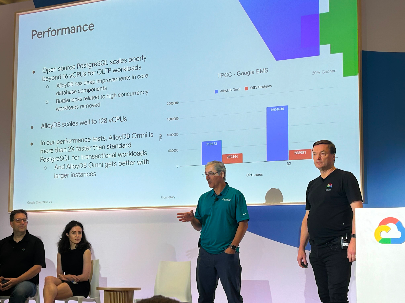
The momentum of Google Cloud Next 2024 kept surging forward as the Developer Summit Keynote took...
The excitement in the audience was palpable as Google Cloud Next 2024 kicked off its opening...

What would our world look like without gender bias? What if gender equity was no longer an...

Giving back to the community is the spirit behind our “Love Your Community” program. Every...

The first postcard of 2023 is from a coastal city where Gopi Kampa helps streamline the onboarding...