Curious about data visualization? Think it’s all about geekdom? In this latest edition of Pythian Postcards, Michael McEvenue takes us to a lovely Canadian town located on the shores of Lake Ontario. Read on to learn more about Michael, his role and, yes, a touch of geekdom too.
Tell us about Oakville and your journey there.
I grew up in Innisfil, by Lake Simcoe, and moved to Toronto in 2015, where I met my wife. Then I moved to Oakville (which is where she’s from) and have been there since the summer of 2018.
The Toronto skyline can be seen from Oakville and although it’s a quiet town, there are still many things to do. My wife and I enjoy different activities that are within walkable range, like walking along the waterfront and enjoying the local restaurants. It’s great to be in a place that has retained a nice tree line and where we don’t feel like we’re surrounded by rows of houses.
What was your path to Pythian?
In February 2021, I started contracting as a Data Visualization Consultant. Actually, I was the first official hire in the role. I was invited to join the team permanently in August, which I excitedly accepted. This has allowed me to develop and implement different initiatives and put standards in place, so there’s a constant growth and leadership aspect about it that I’ve enjoyed. But because data visualization isn’t something you necessarily study, my journey here was a curvy line.
You can study information design and gain some adjacent visualization skills and knowledge, but most people never think that information design is an option (even at the college or university level) because it’s a highly niched space that requires many specific skills; it’s not a typical career path.
Initially, I studied Multimedia Production and Design—which included graphic design, photography, videography, website design and sound production—which captured many of my interests and opened a new world of possibility. I decided to focus on graphic design. After graduation, I worked for a construction company, helping them build their brand by designing their RFPs, presentations and portfolio, and this exposed me to the construction industry. My new interest in buildings and construction eventually motivated me to go back to school to study Sustainable Energy and Building Technology. I’d always been passionate about the environment and renewable energy, so between that and my newfound love for architecture, the program was a great fit.
What I didn’t expect was to be interested in energy analytics, which pushed me to work with Microsoft Excel every day. So, in my next few roles—over the next eight years—I leveraged graphic design while also using data to create visualizations and improve them. By combining these skills, I was bringing different worlds together and developing more engaging presentations to remove the clutter and highlight what matters most.
Was there a transformative moment that led you to focus on data visualization?
At some point, my team had to produce energy analytics reports for multiple clients. It was for an energy management company where every major client had a portfolio of more than 30 buildings. Each building required a report which, at the time, was between 30 and 50 pages. It was very labor and time-intensive for something that most likely wouldn’t be read in depth—and would end up as an expensive paperweight. So, I decided to first condense the information to 10 pages and showcase the most salient information (especially numbers), to make everything visually engaging and ultimately standardize the process across all client portfolios. The process was very data-driven and, of course, visual, so it became a turning point for me and fueled me to do more of the same. Believe it or not, I still didn’t know that data visualization was something one could focus on or that there was a whole industry dedicated to enterprise reporting.
At this point, I had the graphic experience, which gave me the foundation on how visuals work together: Practicing design helped me understand how people think and how design connects to our understanding of the real world. This evolved to learning how to work with data, how to structure it so it could be used and how to implement database normalization. I learned over time that data has different stages and states of being, and despite what anyone says, it often needs to be cleaned and prepared further. Then, the final (and ongoing) stage is learning how to take all this information, structure it and layer the design on top of everything, to make it shine.
So, after working a few more years in energy management, I went back to school to dig into Big Data, Data Analytics and Predictive Analytics to affirm and expand my knowledge in data. I’m insanely curious and a lifelong learner, so going back to school for a third time (hooray!) was great. I dabbled in Tableau and Power BI and decided to pursue data visualization work full time. I could never get bored with it; it’s just something I’m fascinated by. Put it this way: If you put me in front of Tableau (or Power BI) and asked, “How long could you use these while doing your own thing before you got bored?” I could go all night. I get pumped thinking about different aspects of how people respond to information, learn, understand and process information and how I need to prioritize and synthesize everything.
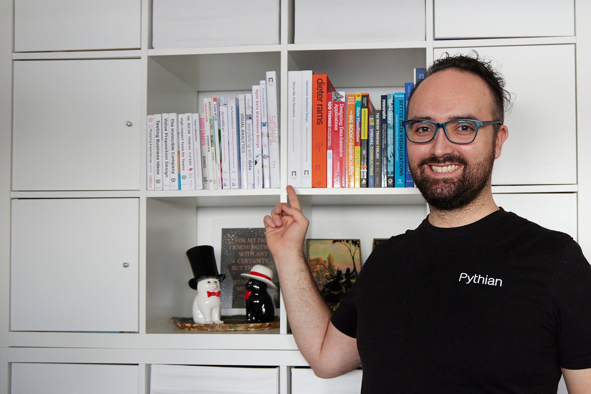
An impressive book collection on one of his favorite topics: data visualization
Since leaving the program, I’ve worked with different businesses, including having my own. This has given me a business perspective—it turns out that data visualization is exactly the mix of interests I had back in high school: engineering, innovation, invention and entrepreneurship. I like when things come full circle.
What’s a typical day like for you now?
So far, there hasn’t been one, and that’s OK. Initially, I was hired to work on EDP Quickstart and help develop a proof of concept. Then, I moved to work on building out another proof of concept for data observation (DataOps). So far, most of my work has been around building data visualization standards and practices, engaging with customers, creating new processes and expanding our offerings. At the same time, I’ve been leveraging my data visualization skills in presentations and customer storytelling.
One of the misunderstandings about data visualization is that it’s exclusively about charts and visuals. It goes beyond that: We use it to connect with customers and internally with employees in a highly diverse team, so it is, ultimately, a communication tool. I also use various platforms such as Slack, Excel/Google Sheets, PowerPoint/Google Slides, Google Cloud Platform (GCP), Power BI, Tableau, Looker and Visual Studio Code for documentation. Between the tasks and the tools, there’s no typical day. I’m enjoying myself and I’m grateful to have fantastic colleagues.
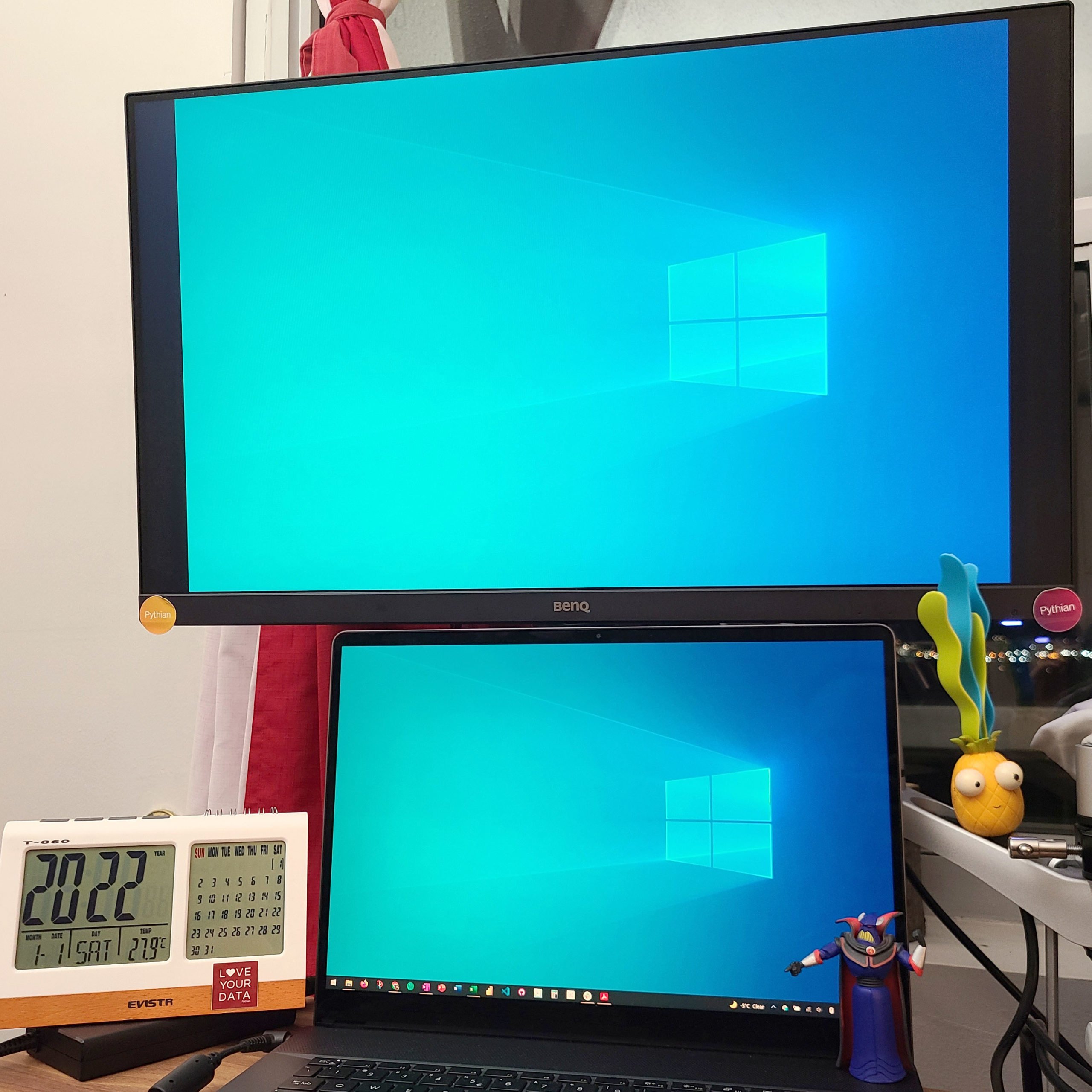
A workstation fit for every data visualization task and tool–including gizmos and action figures
What has been the most surprising discovery about your role?
I’ve been learning about Pythian and my understanding of data visualization has expanded. The experience in this role has been deeply rewarding, and working at Pythian has been better than I could have imagined.
I have learned that I need to think of data visualization and its application from a wider perspective. I can leverage visual communication as a framework, or a method to bring people together, and have a shared understanding of complex concepts. And that is no easy feat! I need to continue to find ways to bridge the conversation between business and technology, and it’s awesome to say I love being a part of that!
Tell us about your workspace.
I’m lucky to have a dedicated office with a nice, elevated window view of a park and the neighborhood. Because I’m mostly glued to my desk during the day, I try to use an optimized setup with a desk-sized mouse pad, a backlit keyboard and an ergonomic mouse and nifty digital clock that helps me keep an eye on the time and review the monthly calendar in one view. (I can’t live without my gizmos and gadgets.) I use a sit/stand desk so I can stand when I want to. This configuration helps me take standing breaks and provides a change in perspective, which I need when the lines between work, home and play are blurry.
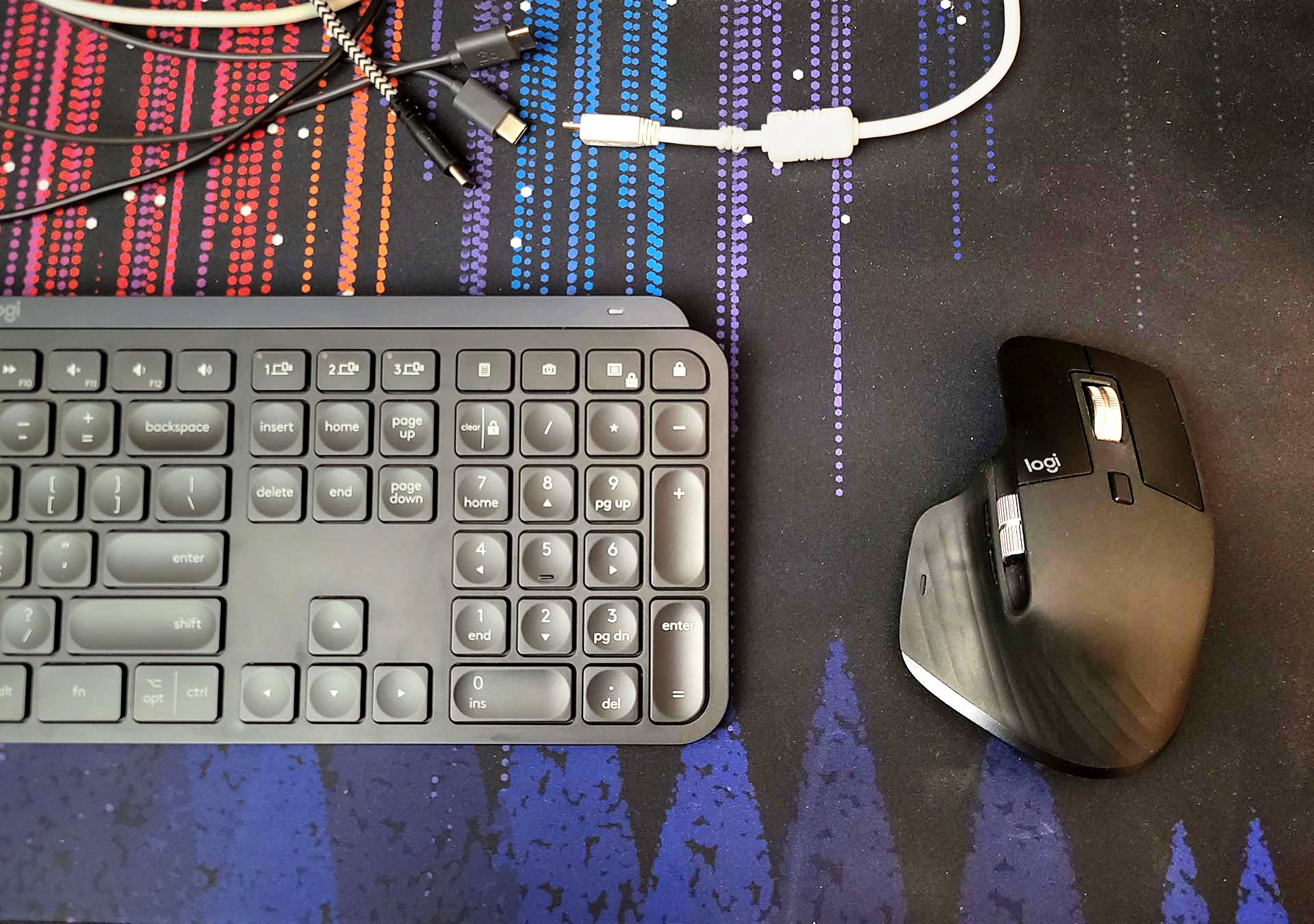
Let’s not forget the ergonomic accessories
How do you spend your time off?
I got my first camera when I was around 10 years old, and I still practice photography today. I play electric/classical guitar and drums and have dabbled in bass. When I was a teenager, my dad and I made an electric guitar out of a solid slab of curly maple. It was a special project for the two of us. These days, my favorite instrument to play is the drums because it’s more forgiving than the guitar—it’s very physical, but because there’s no key signature to follow when you’re jamming, there are no bad notes; just fun. Did I mention I snowboard?
What’s one type of food you could eat every day?
You can’t go wrong with a good soup, like tortilla, cheddar broccoli, minestrone, Yukon Gold potato, butternut squash, chicken noodle or tomato—there are so many options. Don’t underestimate the power of a good soup! It’s simple and packed with flavor and goodness.

Michael’s handmade electric with maple top
Describe Pythian in one word.
Innovative.
Michael, you’re the first interviewee of 2022. Happy New Year!
Follow Michael on LinkedIn.

